 How-to
7 Mobile Usability Errors in Search Console and How to Fix Them
Last Updated: November 19, 2026
Quick Summary
To fix mobile usability issues in Search Console, open the Experience section, review the affected URLs grouped by template, and correct the shared CSS or layout rule behind each error. Then click Validate Fix and confirm the change is live on production before Google recrawls your pages.
- Google retired the standalone Mobile Usability report in 2023 and moved its checks into the Experience reports.
- Set a base font size of at least 16px on the body and use rem or em instead of fixed px.
- Add padding around buttons and links so tap targets are not too close together.
- A proper viewport meta tag is the highest-leverage fix because it resolves scaling before any CSS is touched.
- Validating before the fix is deployed to production is the most common cause of a failed result.
Table of Contents
- Where Mobile Usability Reports Live in Search Console Now
- How to Open an Issue and Review Affected URLs
- The Text Too Small to Read Mobile Error
- Fixing Clickable Elements Too Close Together
- Mobile Viewport Configuration and Content Wider Than the Screen
- Search Console Validation: What to Expect After You Fix a Page
- Test Affected Pages on Real Phones Before You Validate
- Get a Hands-On Mobile Usability Audit from Real Web Marketing
- Frequently Asked Questions
Where Mobile Usability Reports Live in Search Console Now
Mobile usability problems are one of the most common reasons a page underperforms on phones, and this guide shows you how to fix mobile usability issues in Search Console. Google retired the standalone Mobile Usability report in 2023. Its checks moved into the Mobile Usability section of the Google Search Console Help documentation experience reports.
So where do you look now? Open Search Console, choose your property, and select Experience in the left menu. You will find the mobile usability section there, alongside Core Web Vitals.
A few things changed with the move:
- The report now groups issues by URL, not by error type alone.
- Some checks were folded into broader "page experience" signals.
- Mobile-first indexing means Google judges your site on the mobile version first.
That last point matters most. If your mobile page is broken, your desktop page rarely saves you.
How to Open an Issue and Review Affected URLs
Start by clicking the specific issue name, such as "Text too small to read." The report then lists every affected URL, grouped by pattern.
Follow these steps:
- Open the issue report from the Experience menu.
- Review the table of affected URLs at the bottom.
- Click a sample URL to see a screenshot and details.
- Use URL Inspection to confirm the live status of a single page.
- Group URLs by template so one fix covers many pages.
A common mistake is fixing pages one at a time. Most mobile usability errors come from a shared template, so a single CSS or layout change can clear hundreds of URLs at once.
Once you understand the scope, you can plan the fix. Below, we walk through each error type and how to resolve it.
The Text Too Small to Read Mobile Error
The text too small to read mobile error means your page forces users to pinch and zoom to read content. Google flags text that does not scale to a readable size on a phone screen.
The usual cause is a fixed font size in pixels. A paragraph set to 12px looks fine on a desktop monitor and tiny on a phone.
Here is how to fix it:
- Use relative units like
remoreminstead of fixedpx. - Set a base font size of at least 16px on the
body. - Let text reflow instead of locking it to a container width.
- Check your CSS for
user-scalable=no, which blocks zooming.
Watch out: removing zoom controls does not fix small text. It just traps users on a page they cannot read.
If you want to see how good design handles this, review these best website design practices for service companies for real examples.
Fixing Clickable Elements Too Close Together
Clickable elements too close together is a tap-target problem. Buttons, links, and form fields sit so near each other that a finger hits the wrong one.
Fingers are not mouse pointers. A tap covers a wider area, so tight spacing causes mis-taps and frustration.
To fix it:
- Add padding around buttons and links.
- Space menu items and footer links further apart.
- Make the whole button clickable, not just the text.
- Test forms on a real touchscreen, not just a resized browser.
A common mistake is shrinking tap targets to fit more into a row. Fewer, larger targets always beat many tiny ones on a phone.
Mobile Viewport Configuration and Content Wider Than the Screen
Mobile viewport configuration tells the browser how to scale your page on a phone.
Add this line inside your <head>:
That tag sets the layout width to the device width and the initial zoom to 1, so the page renders at phone scale instead of desktop scale.
Watch out: a viewport tag with user-scalable=no or a fixed maximum-scale blocks pinch-zoom. That does not fix small text, it traps users on a page they cannot enlarge, and it can create an accessibility problem on top of the usability error.
Content wider than the screen is a separate failure. The viewport tag is correct, but some element still pushes the layout sideways and forces horizontal scrolling. The fix is not guesswork, it is a diagnostic sequence:
- Open the page in a desktop browser and narrow the window to roughly 360px wide.
- Look for the horizontal scrollbar. If it appears, an element is wider than the viewport.
- Use the browser's element inspector to highlight elements one at a time and find the one extending past the right edge.
- Check the usual suspects in order: fixed-width containers, images without
max-width, wide data tables, embedded iframes and videos, and absolutely positioned elements. - Apply the matching fix and re-check at the same width before moving on.
The matching fixes, by cause:
- Images: set
max-width: 100%andheight: autoso images scale down instead of overflowing. - Containers: replace fixed pixel widths with
width: 100%ormax-widthso the layout flexes. - Tables: wrap wide tables in a container with
overflow-x: autoso the table scrolls inside its own box rather than the whole page. - Embeds: give iframes and video players a percentage width or an aspect-ratio wrapper instead of a fixed pixel width.
- Positioning: audit
position: absoluterules that place elements beyond the viewport edge, especially decorative elements and badges.
A common pattern is overflow that only appears on one template, a product grid, a pricing table, or a blog layout, because the offending rule lives in that template's stylesheet.
Responsive design is the foundation here. A flexible layout adapts to any screen width, so these errors stop recurring instead of resurfacing with each new page.
Search Console Validation: What to Expect After You Fix a Page
Search Console validation is the step that tells Google to recheck your fixed URLs. Click Validate Fix in the issue report once your changes are live.
Validation is not instant. Google recrawls the affected URLs, and timing depends on site size, crawl budget, and how often Googlebot already visits those templates. Here is what each status actually means:
- Started means Google accepted your request and queued the URLs for recrawl. Nothing has been checked yet.
- Validating means Googlebot is actively recrawling and re-evaluating the sample URLs. This phase can run for days on small sites and several weeks on large ones.
- Passed means every sample URL now passes the check. The issue is marked fixed, though non-sample URLs are rechecked over time.
- Failed means at least one sample URL still shows the error. The report lists which ones, so start there rather than revalidating blindly.
A common pattern is a fix that works on the sample URL but not on a sibling template.
Watch out: validating before the fix is deployed to production is the most common cause of a failed result.
Recrawl timing is the other half of the equation. A corrected page is not reflected in the report until Googlebot revisits it, and crawl priority follows internal linking, sitemap presence, and how frequently the URL changes.
If errors keep returning after a passed validation, the cause is usually a shared layout rule rather than the individual page. Work through a step-by-step workflow to fix technical SEO errors so you catch the root cause, not just the symptom.
Here is what each validation status means once you click Validate Fix.
| Status | What it means |
|---|---|
| Started | Google accepted the request and queued URLs for recrawl |
| Validating | Googlebot is actively recrawling and re-evaluating sample URLs |
| Passed | Every sample URL passes; issue marked fixed |
| Failed | At least one sample URL still shows the error |
Test Affected Pages on Real Phones Before You Validate
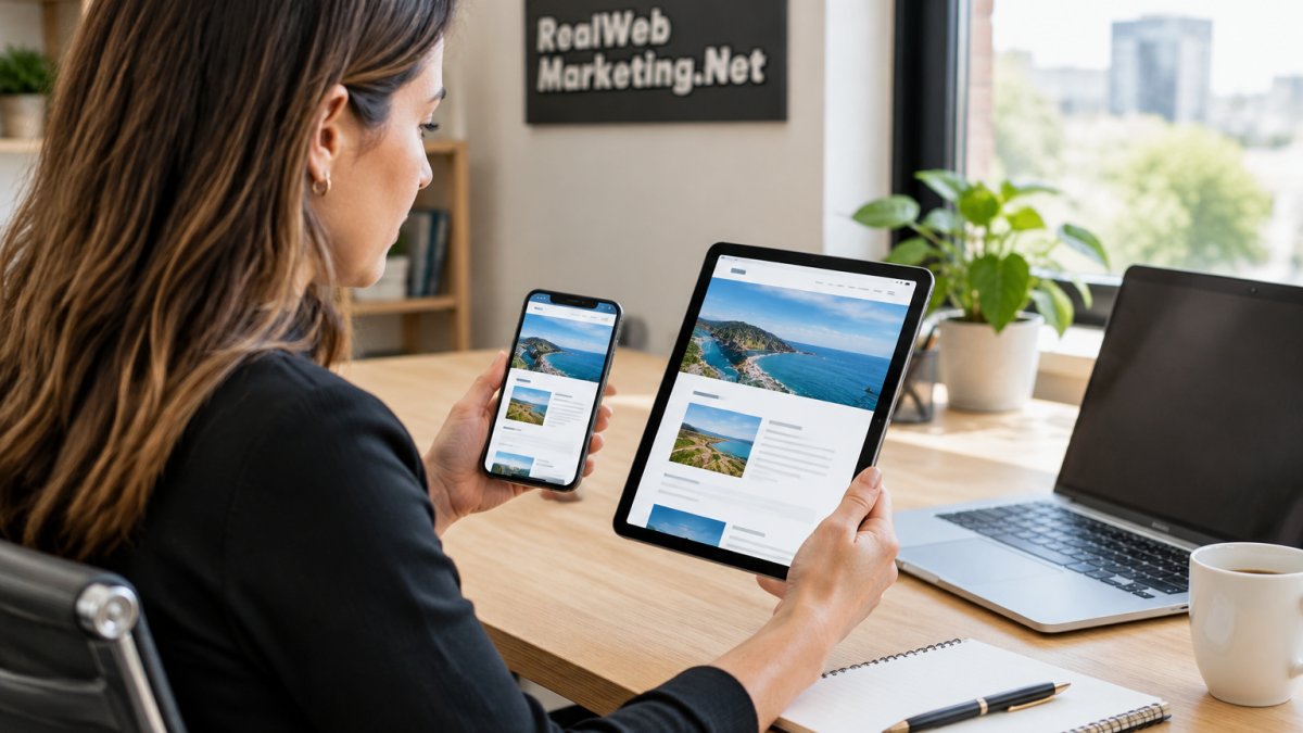
Testing on a desktop browser with a resized window is not enough. Real phones have different screen widths, touch input, and rendering engines.
Before you hit validate, test like this:
- Open the page on at least two real devices, one small and one large.
- Rotate the phone to check landscape layout.
- Tap every button and link to confirm spacing.
- Zoom in to check text scaling.
- Test on both a fast and a slow connection.
Heatmaps help here. They show where real users tap, scroll, and give up, which reveals problems a screenshot misses. Learn how to use heatmaps to improve user experience to spot the friction behind your usability errors.
Get a Hands-On Mobile Usability Audit from Real Web Marketing
Fixing mobile usability issues in Search Console is manageable when you know where to look.
That is where a hands-on audit helps. At Real Web Marketing Inc., we review your Search Console reports, test your pages on real devices, and trace each error back to its source.
Our team brings 35+ years of combined experience across SEO, web design, and paid search. We are also Google Partners.
Mobile-first design affects more than error reports. It shapes how Google ranks your pages, and our guide on whether mobile-first design improves rankings explains the connection.
Ready to clear your mobile usability errors for good? Explore our local digital marketing services and see how we help businesses turn a cleaner site into more leads.
Your mobile pages are the first thing Google and most visitors see. If Search Console is flagging errors you have not resolved, every week you wait costs you visibility and leads.
Frequently Asked Questions
Why does Search Console report a mobile usability issue when the page looks fine on my phone?
Your phone may be rendering a cached or personalized version, or your screen is wider than the test device Googlebot uses. Search Console flags pages based on a narrow mobile viewport, so a layout that looks acceptable on a large phone can still fail on smaller screens. Check the affected URL in the URL Inspection tool, then reproduce the issue at a narrow width and on a small physical device. Issues like text too small to read or clickable elements too close together often appear only at the smallest widths.
How long does it take Google to validate a mobile usability fix?
After you click Validate fix, Google queues the affected URLs for recrawling. Most small sites see results within a few days to a couple of weeks, but large sites or pages with slow crawl demand can take longer. Validation runs in batches, so you may see the status move from Started to Passed or Failed in stages. If validation fails, the report lists the URLs that still show the error, and you can fix and resubmit. Confirm the fix on a live page first so you do not waste a validation cycle.
Does mobile usability affect mobile-first indexing and rankings?
Google indexes the mobile version of most pages first, so problems with mobile layout, viewport configuration, or tap targets can affect how your content is understood and how it performs in search. Mobile usability issues are not a direct ranking factor on their own, but they overlap with page experience signals and can hurt engagement, which does affect search traffic over time. Fixing viewport and tap target errors keeps the mobile version clean and removes friction for visitors arriving from search.
How do I fix clickable elements that are too close together?
Increase the spacing and size of links, buttons, and form controls so each tap target has enough room around it. Add padding to the element itself, add margin between adjacent elements, and avoid stacking small icon links in a tight row. In your CSS, set a minimum height and width for buttons and links, and test the result with a finger, not a mouse. After the fix, run URL Inspection on a sample page and then use Search Console validation to request a recrawl.